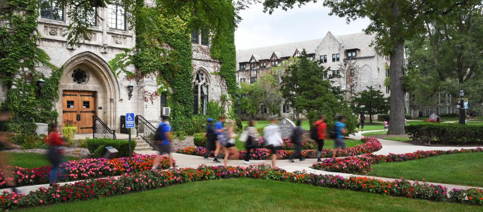
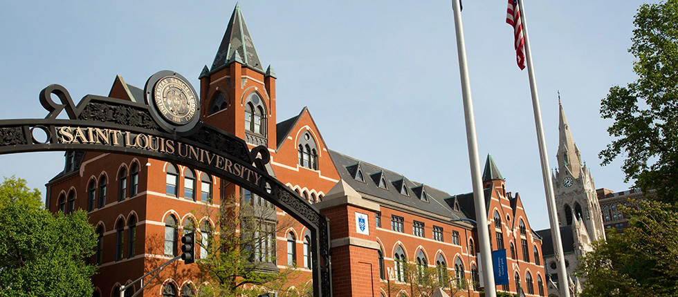
University background
- Institution Type: Private religious university
- Location: Midwest
- Modalities: On campus, online hybrid, regionwide through partnership with community colleges
The situation
In 2019, our University partner expanded their online offerings and was looking to attract a new audience of potential students. Despite market research data showing that both interest and audience were growing for these online programs, the University wasn’t getting sufficient traffic to these new website pages — and what little traffic they got wasn’t converting.
Like many schools, the University’s website had grown organically over the years to reflect the changing needs of the institution — organized by internal processes instead of how a student looks for information — often at the cost of the user experience.
As Collegis dug into the website performance data, we realized that although the University’s online-hybrid programs had become more robust and accessible, they had hit a communications snag. Over the years, their fragmented website had become an experience full of friction to the user — high bounce rates, low time spent on page, poor placement in search results — and they were seeing the negative results in their data.
As with most colleges, our partner didn’t have experts on staff who can diagnose the root cause of this kind of issue, or effectively fix them. In short, the University knew their online prospects weren’t finding the right information to convert, but they didn’t know what to do about it. That’s where Collegis could step in and make the difference.
Our University Partner needed someone who understood complex web navigation and had the resources to fix it.
The challenges
To identify where and why prospective students were getting hung up or confused on the website, Collegis performed a full website audit. Our experts tested the user experience of the University’s site to find and remove the faults and friction that were inhibiting the website — typically a university’s most valuable marketing tool — from performing.
In this case, the primary issues were:
- User Confusion with Site Architecture: Programs and modality were organized by the University’s internal processes, not by how a user seeks out the information. This made it difficult and frustrating for a prospect to find what they were looking for.
- Duplicate Pages: Because information was organized under modality silos, some programs had multiple pages of nearly identical information. This duplicate content causes distrust by search engines and lowers the position in a search engine results page (SERP).
- No Program Finder: Program pages are often the most sought-after information on a college’s website. The University didn’t have a single source of all programs — or a way to sort and search them.
The solutions
In order to increase web traffic and conversions, Collegis performed and implemented the following:
- On-Page Content Optimization: Degree and program pages were redesigned to increase consistency, visibility and conversions. Many had been thin on content, making it difficult for search engines to understand the value of a page and why they should make it visible as a search result.
- Improving Calls to Action (CTAs): Placement of CTAs within the application conversion path on the homepage and program pages made it simpler for prospects to apply and request information.
- Foundational and Technical SEO: Improvements were made in terms of basic website functionality, such as cleaning navigation, correcting 404 errors and redirects, addressing site speed, improving folder structure and breadcrumb navigation, etc., to drive additional relevancy and authority — and improve visibility within the SERPs.
- Local SEO: Simply establishing a consistent name, address and phone number across the website gave search engines confidence that they understand who our partner is, what they do and where they are located.
The results
- User pathing from the homepage to program pages went from 14 .1% to 2 3 .1%
- The top three visited sections from the homepage post-launch became the Program, Graduate and Undergraduate sections
- The site experienced a 13.4% increase in new sessions
- All programs can now be seen in one place, making it easier to find and compare degree programs
Key takeaway
In the first year, the University saw website conversion rates increase 35%, despite the challenges of COVID-19 on higher education.
Let our experts help you find the solutions to your student experience, technology and admissions challenges.
Other Case Studies
Transform Challenges Into Opportunities
Facing challenges in enrollment, retention, or tech integration? Seeking growth in new markets? Our strategic insights pave a clear path for overcoming obstacles and driving success in higher education.
Unlock the transformative potential within your institution – partner with us to turn today’s roadblocks into tomorrow’s achievements. Let’s chat.


