At Collegis Education, data is in our DNA. It’s the foundation of everything we do.
Higher education institutions have a mountain of data at their fingertips. But for many, the more data they have, the more challenging it can be to find meaning in it. It’s far too easy for patterns and insights to become hidden in the rows and columns of a daunting spreadsheet.
Even after discovering key numbers, relevance can be lost without cross-referencing the results against other data sources such as Google, a customer relationship management (CRM) system or a learning management system (LMS). How can you harness this wealth of knowledge and use it to help advise your recruitment strategies?
If you’re overwhelmed with your data, you’re not alone. Utilizing enrollment dashboards is an efficient way to organize the information you have in a meaningful, easy-to-read way. Keep reading to see some examples of enrollment dashboards we feel are helpful for making recruitment decisions.
10 Enrollment dashboards that will bring your data to life
When the information is overflowing, take a step back and start with the questions you have about your data. From there, building a dashboard will help you keep a pulse on important insights at a glance. Here are some examples to consider.
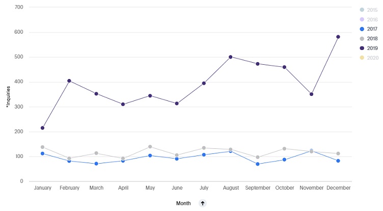
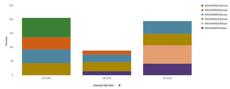
Dashboard 1: Enrollment trends
Can you tell whether your inquiries, apps or starts are up? By understanding general year-over-year performance, you can start planning for the future. By comparing year-over-year and quarter-over-quarter statistics, admissions teams can monitor their progress and whether they’ve hit previous benchmarks.
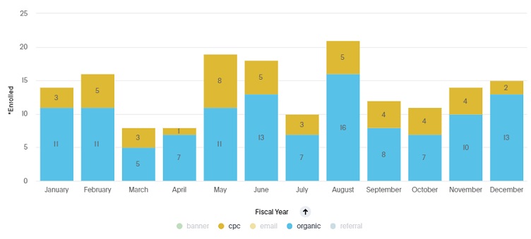
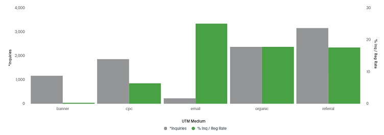
Dashboard 2: Marketing source trends
What marketing sources are driving leads, apps and starts? By understanding marketing sources, your team can begin to understand what efforts are driving interest in the college.
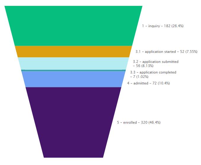
Dashboard 3: Admissions pipeline
What does your pipeline look like for prospective students? By understanding the stages that prospective students are in, admissions teams can start to pinpoint bottlenecks and reprioritize resources to help move students through the funnel more efficiently.
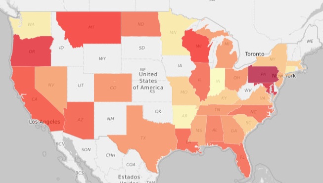
Dashboard 4: Geography
Which areas of the state, region and country is interest coming from? Often, prospective student interest can come from pockets around the campus location. By understanding where interest is coming from, marketing teams can redistribute resources to strategically identified target areas.
Dashboard 5: Distance groupings
How do yield rates differ based on distance from campus? By grouping things like interest or applications by distance, you’ll start to understand how yield rates change based on how far prospects are from campus. This can help your marketing team ensure that marketing dollars are allocated to the areas with highest potential.
Dashboard 6: Yield rate
What is your yield rate by marketing channel? Marketing channels can generate a wide range of results. Some channels deliver higher-quality inquiries while others deliver higher quantities. By looking at yield rate by channel, you can adjust your marketing investments to maximize the return.
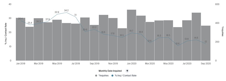
Dashboard 7: Admissions efficiency
How long is it taking your admissions reps to contact prospective students? By measuring this variable, admissions leaders can assess the relationship of response time to application volume, acceptance rate and likelihood of enrollment. In our experience, this metric is often overlooked, but it’s been a critical indicator for us and our partner institutions.
Dashboard 8: Rep performance
Do you know which of your admissions representatives are driving starts? This can help you ensure that your top performers are free to focus on inquiries rather than paperwork. Alternatively, it can help you identify which admissions reps your staff should look to learn from.
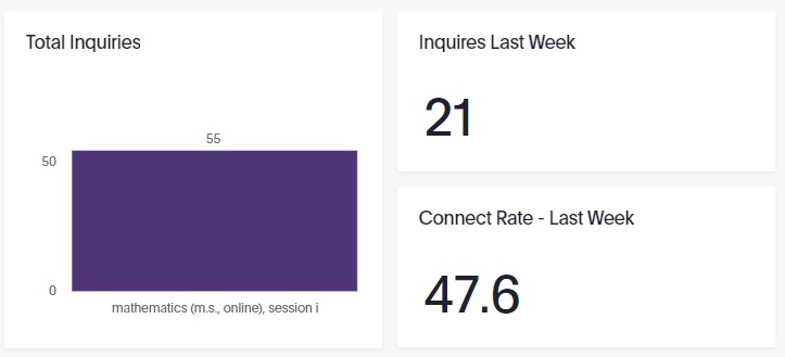
Dashboard 9: Campus performance
How are different campuses performing relative to each other? Typically, each college, school and program will have different yield rates. By comparing them, you’re able to help prioritize resources across campuses and identify opportunities to grow enrollment.
Dashboard 10: Performance against goal
How is the college performing against its goals? An enrollment dashboard should, ultimately, inform how the college is faring in its pursuit of enrollment goals. By measuring against these goals, teams can quickly know how they are doing and adjust if needed.
Put your data to work for you
Dashboard reviews are a great way to verify your assumptions with data. By making a practice of reviewing dashboards, you’ll quickly notice when changes occur, which allows you to be more nimble in your approaches by adjusting as the market fluctuates.
Creating enrollment dashboards such as these makes it easy for your data to tell a story. These visualizations will help make data-driven decision-making easier for you and your entire higher education management team.
The dashboard examples above were created using a data visualization tool called Collegis Discovery Engine, which is available to our higher education partners. Curious how this could work for your institution? We’re here to help!
Author: Dan Antonson
Dan Antonson is the associate director of marketing technology and analytics with Collegis Education. He holds a Bachelor's of Communication from the University of Minnesota, Twin Cities.

