
Higher Ed Insights + Events
Welcome to the Collegis Blog & Events Hub — your go-to source for expert insights, trends, and events shaping the future of higher ed. Explore strategies that turn challenges into opportunities and connect with leaders driving innovation through data, technology, and talent.
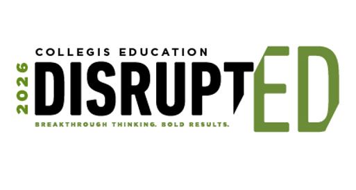
Event: DisruptED 2026
Back by popular demand, our exclusive higher ed event is coming this fall to Denver, CO — bringing together forward-thinking leaders to explore the strategies, technologies, and decisions shaping what’s next. Join your peers in shaping the future of higher education.
Insights + News
Explore our resources to keep a pulse on the latest trends in higher education with exclusive insight from Collegis experts.


Higher Ed Events
Don’t miss your chance to engage with higher ed leaders and Collegis experts. Check out our upcoming events and secure your spot today.
Transform Challenges Into Opportunities
Facing challenges in enrollment, retention, or tech integration? Seeking growth in new markets? Our strategic insights pave a clear path for overcoming obstacles and driving success in higher education.
Unlock the transformative potential within your institution – partner with us to turn today’s roadblocks into tomorrow’s achievements. Let’s chat.